styled-system
Our system props are powered by styled-system, which "lets you quickly build custom UI components with constraint-based style props based on scales defined in your theme". Check out the official docs first.
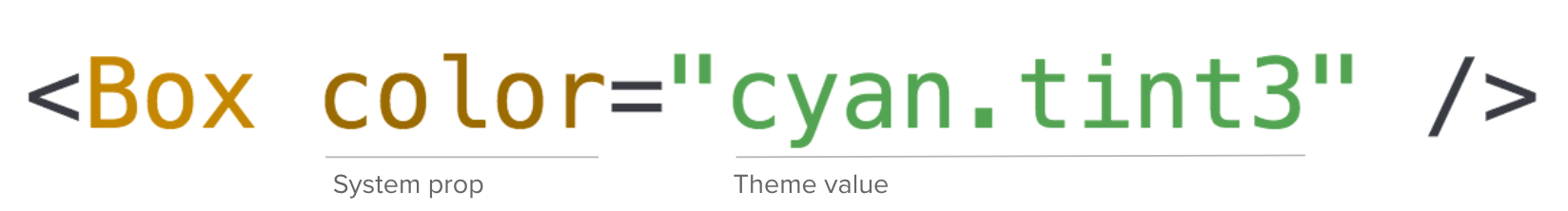
In this example, the Box component accepts a color system prop. The value of color can be any color value defined
in our theme, or any acceptable css color value. One caveat here is because we are defining colors as an object, you will
not be able to use values like blue or red directly (they will output as [Object object]). The output of the above
component is:
.foobar {color: #DBF4ED;}
Visit the Theme page for more information.
System Props
We group some common props for convenience, which we call system props. i.e. COMMON = compose(color, display, space);
Prop categories
See: https://github.com/styled-system/styled-system/blob/v5.1.2/docs/table.md (Please ensure the version in the URL is aligned to styled-system in package.json)
Polymorphic as and forwardedAs Props
Most houzz-ui components have access to the as prop, provided by styled-components.
We use the as prop to render a different base element than the root styled component.
For example, <Box as="span"/> or <Text as="p"/> would render a span or p tag respectively.
NOTE: Use your best judgement when changing the underlying element type. e.g. Do not change something that is usually a <select/> to a <code/> tag.
Often times, you may find yourself needing to extend some styles from a houzz-ui component. In this case, the as prop will no longer
work because it changes the root component. Use forwardedAs to work around this issue:
const MyBox = styled(Box)`// style overrides`;<MyBox forwardedAs="span">Span</MyBox>
if as was used, any styles in Box would be dropped.
Responsive Values
...